Styling CalendarApp Widgets
Below is a diagram which labels the various selectors in a CalendarApp Widget:
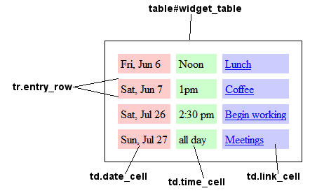
Below is the style sheet that was used for the table above. Feel free to copy and modify it.
body#widget {}

table#widget_table {
  margin:auto;
  padding:1%;
  border:1px solid black;
  border-spacing:8px;
}

td {
  padding:4px;
}

a:hover {
  background-color:#eee;
}

td.link_cell {
  background-color:#ccf;
}

td.date_cell {
  background-color:#fcc;
}
You can also modify the widget's container on the calling page. Take the following-
<div style="width:20em; height:12em; margin:auto; padding:1ex; background-color:#eef;">

 <div style="text-align:center;">Schedule</div>

 <iframe src="calendarapp-widget-iframe.html" width="99%" height="99%" frameborder="no" scrolling="no"></iframe>

</div>
By enclosing the widget in a "div" container, you can adjust the height and width of the widget, place it on your page, add a border around it, or change its background color.
Schedule
Please post questions regarding style sheets and CalendarApps on the CalendarApp Forum.